
Concepts Unearthed – The Beginnings of Mega Man 10

TMMN Staff

Late last year, we revealed to you the eye opening initial concepts for the Mega Man 9 Robot Masters, and Mega Man 10 was promised in short order. Well… better late than never, right? Right!?
Truth be told, unlike Mega Man 9, which featured wildly different boss concepts to what was finally in the game, Mega Man 10 appears to have been more straightforward from the get go. Not so many drastic changes and gender swaps here, but still some interesting pre-designs nevertheless.
This time I’m going to show you a bit more than I think you deserve *nudge nudge* and translations of commentary by character design Yuto Watanabe. Nevertheless, if and when R20+5 reaches western localization, you should definitely pick it up! Our coverage here just doesn’t do the tome justice.
DWN-073 – Blade Man
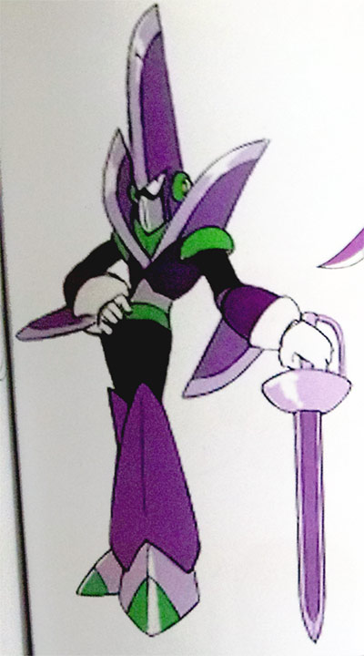
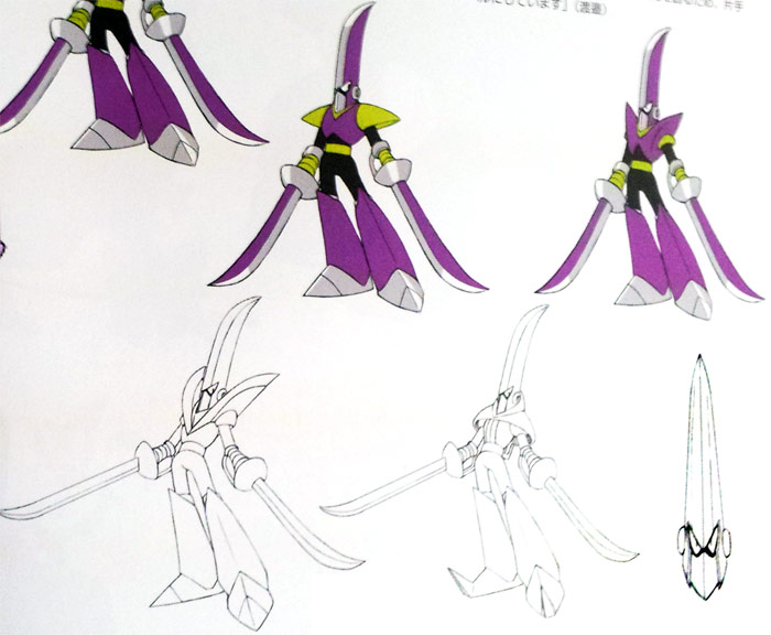
At the immediate start I drew him with a helmet that had a cockscomb-like sword extending up, but since the novelty in that wore off, I settled on a design outside of my expectations from my early stage doodles. Likewise, when thinking of other bosses, which the Mega Man series already has plenty of, I paid attention not to mimic a past boss’s design. With Blade man, I decided on making both his hands sabers, instead of just the one, to attempt to differentiate him from the similarly sword themed Sword Man.
DWN-074 – Pump Man
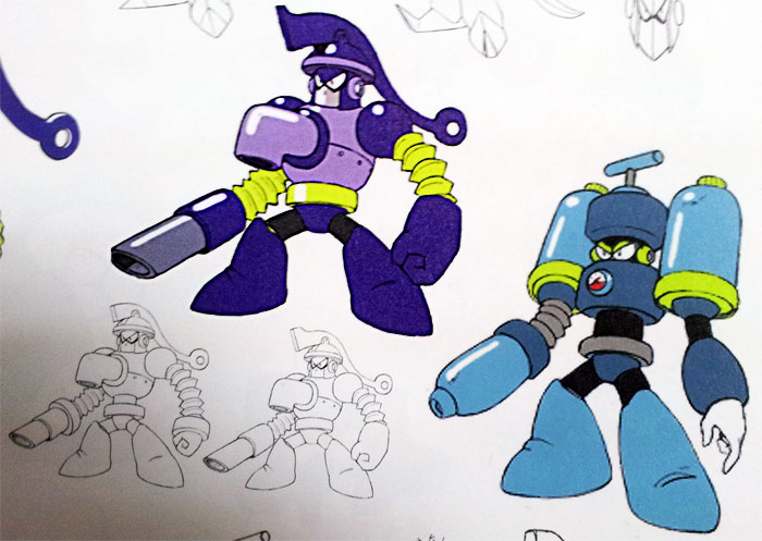
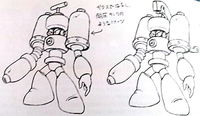
With Pump Man, I’d heard from the planner “I want him to have an action where he pumps water by cranking a lever on his own head.” After deciding where his water spout would be placed, the final design resulted relatively early in planning. When we looked at the bosses side by side at a certain stage there was no one with a bitter, angry looking face, so Pump Man was bestowed that honor.
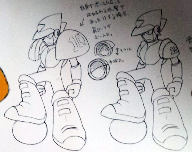
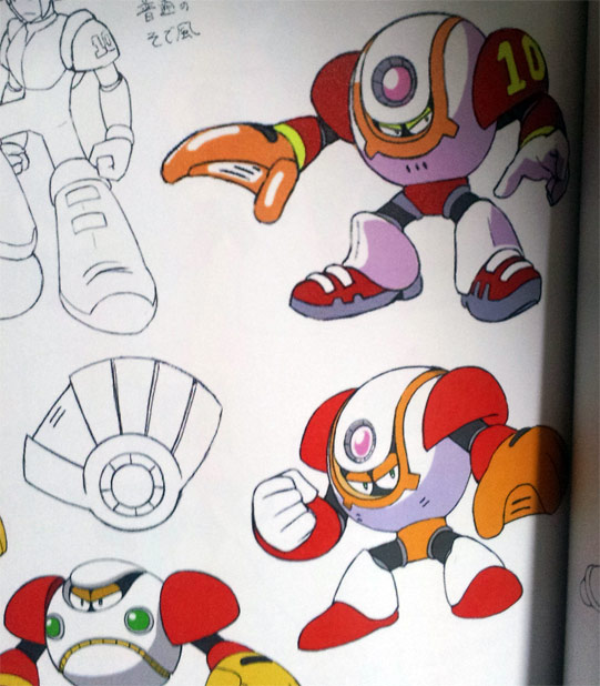
DWN-075 – Commando Man
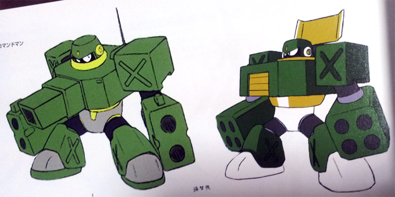
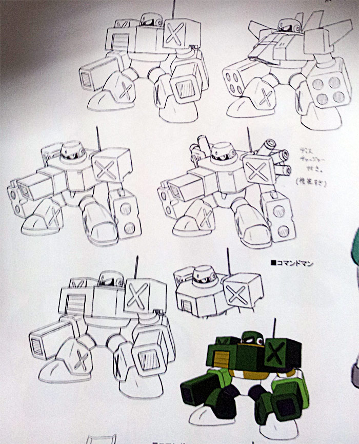
The previous game’s “power character,” Concrete Man, featured a design constructed of rounded parts. Since Napalm Man, another military type boss, also featured a rounded kind of design, it was decided early on that Commando Man would feature a design with sharp edges and corners. After that, it was discussed what number of armaments you’d see on him for the attacks he uses in the game. In the end we made his armaments simple, and transferred the chest cannon attribute to the present Pump Man design.
DWN-076 – Chill Man
In the initial plans, Chill Man had been the “power type” character, but while changing around the overall positions of the eight bosses, Chill Man became the cool looking humanoid type character. As there were already enough hero-ish humanoid bosses that had some key symbol or fixture on their forehead, I made him a boss that expresses an interesting design among the other cool ones.
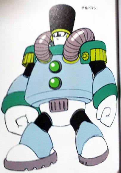
DWN-077 – Sheep Man
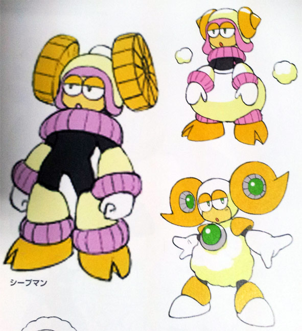
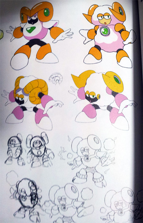
In Sheep Man’s initial stages, he was thought up as a character with rounded eyes like Heat Man. Being a sheep he had this sleepy eye image, plus I had thought it was necessary that one or two bosses among the eight have rounded eyes.
Sheep Man gave me the roughest time for a number of reasons. In the end I went with a design that I’d got from Inafune, but with this I feel that it continues the line of animal type bosses like Uranus and Hyper Storm H.
DWN-078 – Strike Man
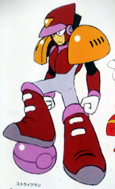
In the beginning, Strike Man’s designation as “a boss who’s skilled at all sports” was vague, and working out a suitable design was really frustrating. After a while, I got instructions saying “Narrow his theme down to baseball” and “We want his body to be a ball,” so his design was decided as an Air Man type, and from there the present design passed with no objections.
DWN-079 – Nitro Man
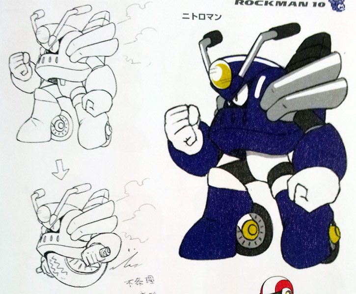
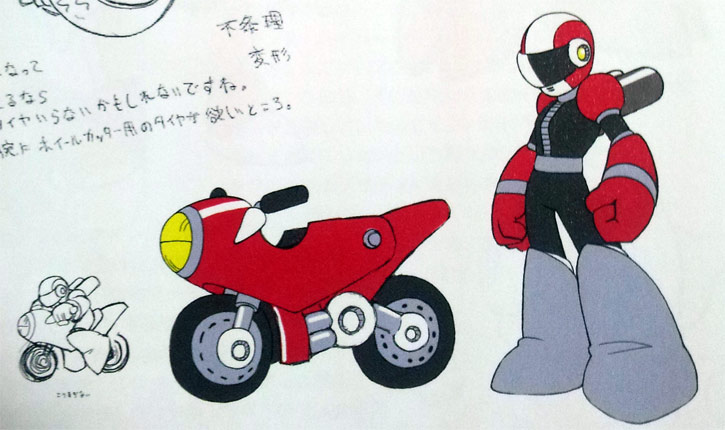
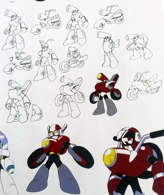
Both Nitro Man and Strike Man were devised as Air Man type characters, so Nitro Man was switched to a humanoid type during revision. Along the way, I troubled over his transformation mechanism. A person riding a bike type form was the coolest in my mind, so with that he gained a form representing the rider and the bike separated. To clearly differentiate him from a car, handlebars extend from the top of his shoulders.
DWN-080 – Solar Man
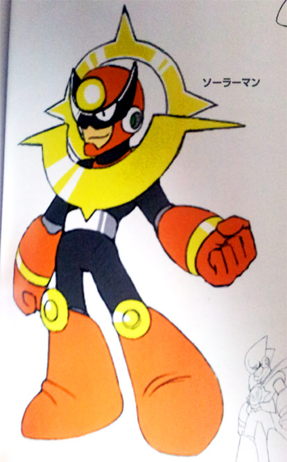
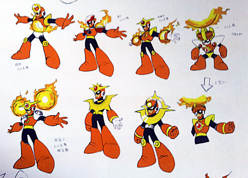
Originally I’d thought of Solar Man as a boss who emits solar rays, like his name suggests. But I heard the staff wanted him to release fire, not sunlight, so I changed the design to one where an artificial sun is produced. Following suit, his head portion became the sun part, and his stature shrunk down. I was surprised at what an incredibly merry character he’d become with the finished sprites.
Prev/Next in Category(s)
Prev/Next by Date

Mega Man Legends 3 Neo Devroom Finds New Home on Fanon Wiki
More mirror madness.

Press Release: PREORDERS ARE OPEN! Snag Your June Books Now 📚
JUNE PRE-ORDERS ARE NOW LIVE!


Comments